


Introduction
CSS Grid is a powerful layout system that revolutionizes the way we create responsive web designs. With its intuitive grid-based approach, CSS Grid allows you to create complex, flexible, and dynamic layouts with ease. In this comprehensive guide, we will dive into the world of CSS Grid, exploring its key concepts, features, and techniques. By the end of this article, you'll have the knowledge and skills to master CSS Grid and build stunning, responsive web layouts.
Understanding the Grid Structure
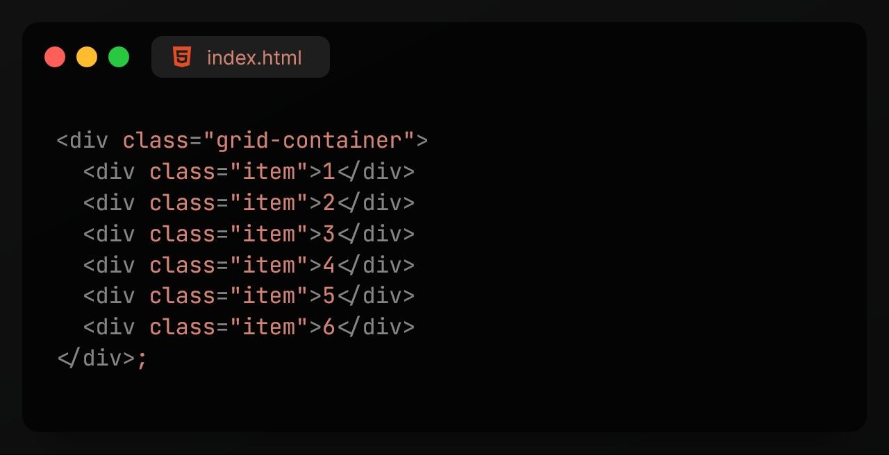
CSS Grid introduces a two-dimensional grid system consisting of rows and columns. By defining a grid container and its grid items, you establish the foundation for your layout. Understanding the grid structure is essential for creating flexible and responsive designs.
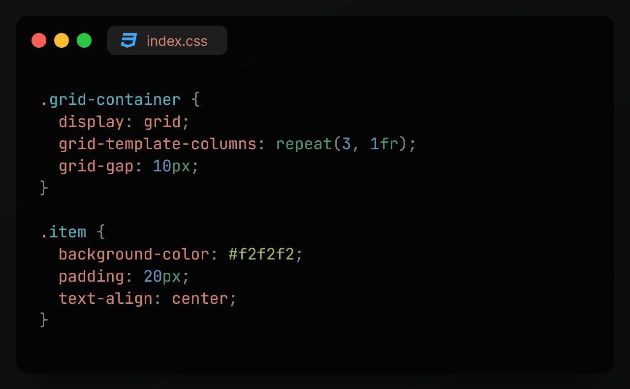
Defining the Grid Container
To create a grid layout, you first need to define a grid container. This is achieved by applying the display: grid; property to the container element. Additionally, you can customize the grid's behavior using properties like grid-template-rows, grid-template-columns, and grid-gap.
Placing Grid Items
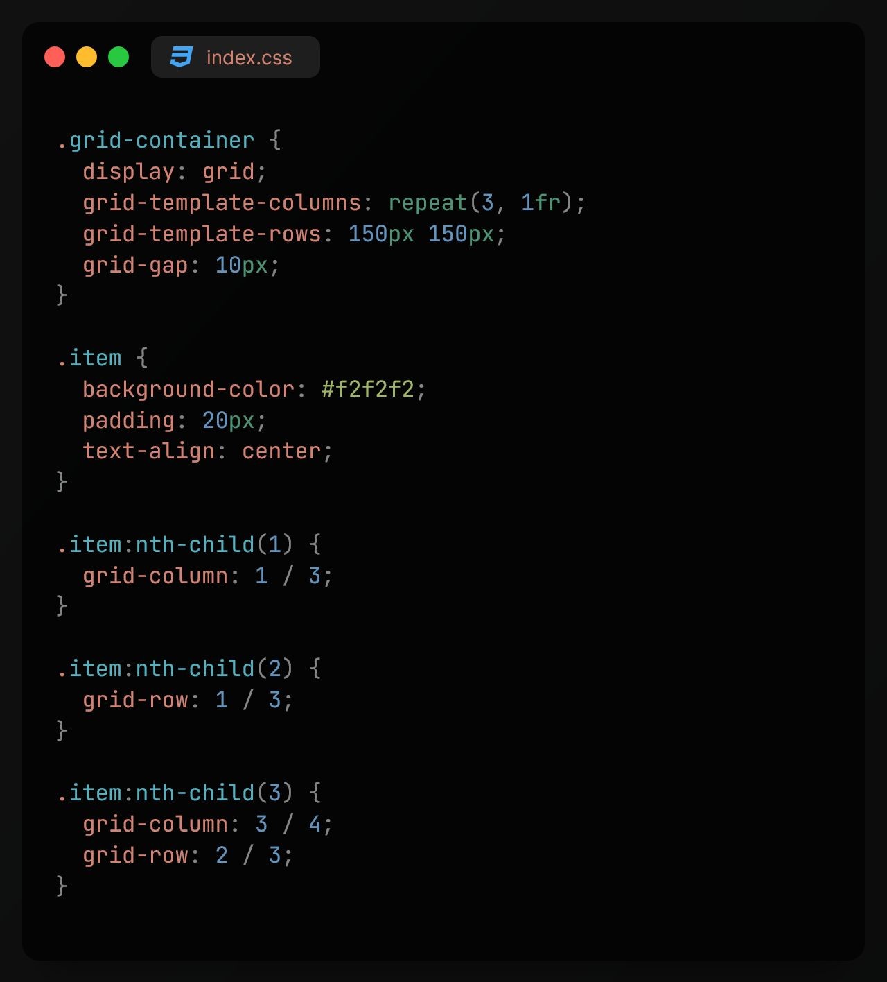
Grid items are the elements contained within the grid. With CSS Grid, you have full control over their placement and sizing. You can use properties like grid-row and grid-column to position items within specific grid cells. Additionally, you can utilize the grid-area property to assign grid areas to items, simplifying the placement process.
Creating Flexible Grid Layouts
One of the standout features of CSS Grid is its ability to create flexible layouts. By utilizing features like fractional units (fr), you can define flexible widths and heights for grid columns and rows. This ensures that your layout adapts smoothly to different screen sizes and devices.
Responsive Design with CSS Grid
CSS Grid plays a crucial role in building responsive web layouts. You can utilize media queries to adjust the grid's behavior based on the viewport size. By modifying grid properties and redefining the grid structure, you can create responsive designs that provide optimal user experiences across various devices.

Grid Alignment and Justification
CSS Grid offers powerful alignment and justification capabilities, allowing you to control the positioning of grid items. You can use properties like justify-items, align-items, justify-content, and align-content to align items within grid cells or adjust their distribution within the grid container.
Nested Grids and Grid Tracks
CSS Grid supports nested grids, enabling you to create complex layouts with multiple levels of grids. This feature allows for greater flexibility and organization within your designs. Additionally, grid tracks enable you to specify the sizing of rows and columns with precision, whether through fixed sizes, flexible units, or the auto keyword.
Grid and Accessibility
When using CSS Grid, it's essential to consider accessibility. Ensure that your grid-based layouts are navigable and understandable by users relying on assistive technologies. Use appropriate markup, descriptive labels, and clear visual cues to enhance the accessibility of your grid layouts.
Conclusion
CSS Grid is a game-changer in the world of web layout design. With its ability to create responsive, flexible, and visually appealing layouts, mastering CSS Grid is a valuable skill for any web developer. By understanding the grid structure, placing grid items, creating flexible layouts, implementing responsive design, utilizing alignment and justification, exploring nested grids and grid tracks, and considering accessibility, you can unlock the full potential of CSS Grid and build remarkable web layouts.

